Guess Who?
Star Wars edition
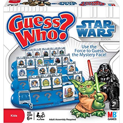
Are you the best Jedi detective out there? Let’s play a game to find out.
Guess what else comes with the dplyr package?
- A Star Wars data set.
Open the data
- Load the
dplyrpackage from yourlibrary() - Pull the Star Wars dataset into your environment.
library(tidyverse)

people <- starwars
Rules
- You have a top secret identity.
- Scroll through the Star Wars dataset and find a character you find interesting.
- Or run
sample_n(starwars_data, 1)to choose one at random.
- Or run
- Keep it hidden! Don’t show your neighbor the character you chose.
- Take turns asking each other questions about your partner’s Star Wars character.
- Use the answers to build a
filter()function and narrow down the potential characters your neighbor may have picked.
For example: Here’s a filter() statement that filters the data to the character Plo Koon.
mr_koon <- filter(people,
                  mass       < 100,
                  eye_color  != "blue",
                  sex        == "male",
                  homeworld  == "Dorin",
                  birth_year > 20)
My character has NO hair! (Missing values)
Sometimes a character will be missing a specific attribute. We learned earlier how R stores missing values as NA. If your character has a missing value for hair color, one of your filter statements would be is.na(hair_color).
What if you know the value is NOT NA? To add that to your filter you add an ! (exclamation point) in front of is.na(). In R the ! signifies NOT or the opposite of what comes after.
So:
!=translates to “is NOT equal to”!is.na()translates to “is NOT NA”
WINNER!
The winner is the first to guess their neighbor’s character.
WINNERS Click here!
Time for a rematch?
Feel free to challenge someone new.
Load your saved scrap data
# Your saved data
scrap <- read_csv("results/scrap_day2.csv")

# For those just joining us
#scrap <- read_csv("https://mn-r.netlify.app/data/scrap_day2.csv")
1 ifelse()
[If this is true], "Do this", "Otherwise do this"

Here’s a handy ifelse statement to help you identify lightsabers.
ifelse(Lightsaber is GREEN?, Yes! Then Yoda's it is, No! Then not Yoda's)
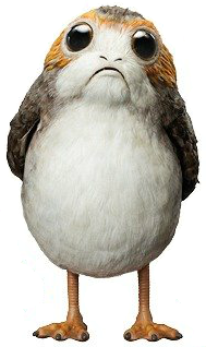
Or say we want to label all the porgs over 60 cm as tall, and everyone else as short. Whenever we want to add a column where the value depends on the value found in another column. We can use ifelse().
Or maybe we’re trying to save some money and want to flag all the items that cost less than 500 credits. How?
mutate() + ifelse() is powerful!
On the cheap
Let’s use mutate() and ifelse() to add a column named affordable to our scrap data.
# Add an affordable column
scrap <- mutate(scrap,
                affordable = ifelse(price_per_unit < 500,
                                    "Cheap",
                                    "Expensive"))
Explore!
Use your new column and filter() to create a new cheap_scrap table.
# Cheap scrap table
cheap_scrap <- filter(scrap,  _________ )
How many items are cheap?
n_distinct(cheap_scrap$item)What are the cheap items?
Try the unique() function on cheap_scrap$item.Pop Quiz!
Use arrange() to find the cheapest item.
What is it?
Black box
Electrotelescope
Atomic drive
Enviro filter
Main drive
Show solution
Black box
You win!
CONGRATULATIONS of galactic proportions to you.
We now have a clean and tidy data set. If BB8 ever receives new data again, we can re-run this script and in seconds we’ll have it all cleaned up.
2 Plots with ggplot2
Plot the data, Plot the data, Plot the data
The ggplot() sandwich

A ggplot has 3 ingredients.
1. The base plot
library(tidyverse)ggplot(scrap)
We load version 2 of the package
library(ggplot2), but the function to make the plot is plainggplot(). Sorry, ggplot is fun that like that.
2. The the X, Y aesthetics
The aesthetics assign the columns from the data that you want to use in the chart. This is where you set the X-Y variables that determine the dimensions of the plot.
ggplot(scrap, aes(x = destination,
y = amount)) 
3. The layers AKA geometries
ggplot(scrap, aes(x = destination,
                  y = amount)) +
  geom_col()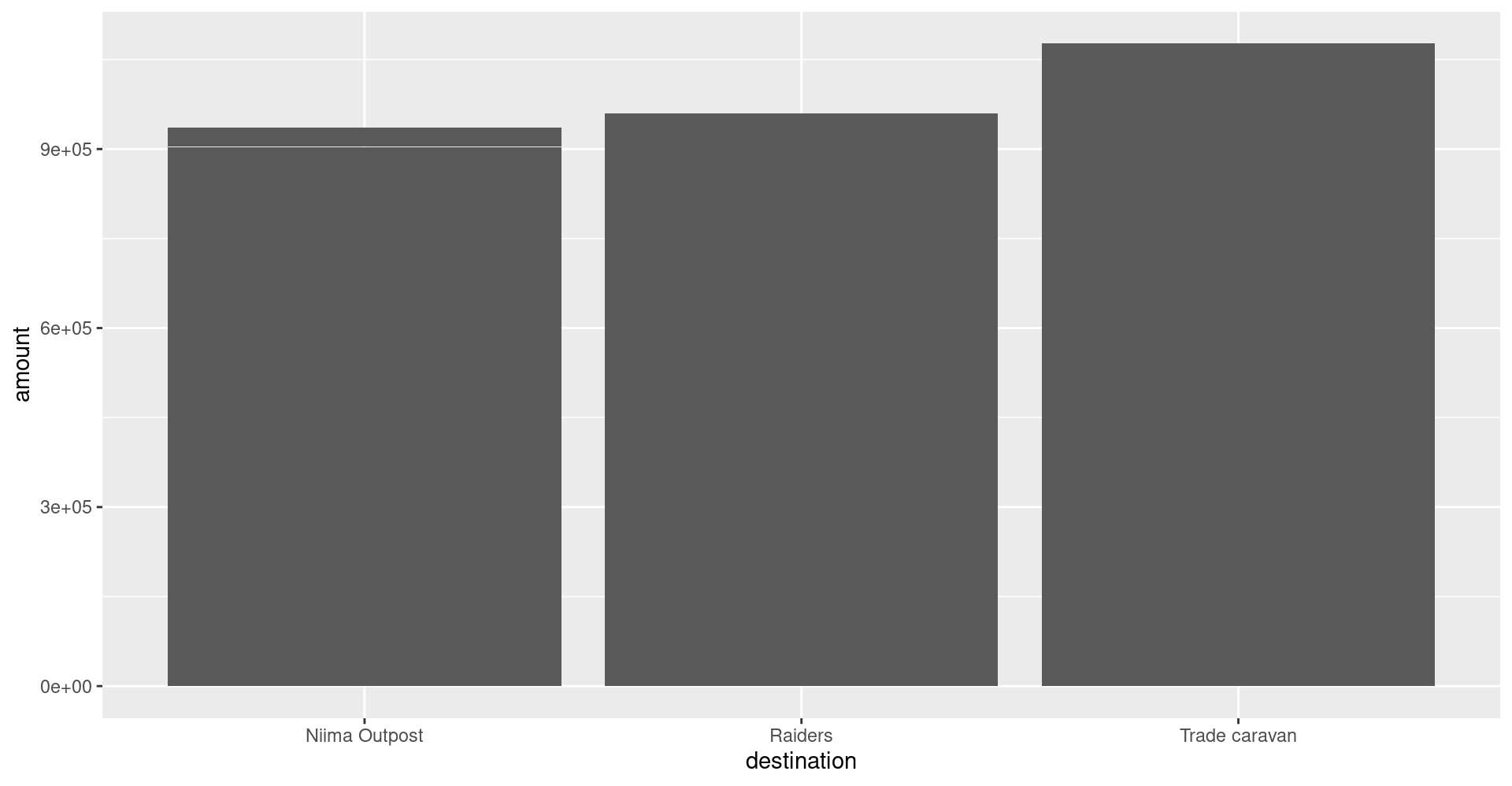
Colors
Now let’s change the fill color to match the destination.
ggplot(scrap, aes(x = destination,
                  y = amount,
                  fill = destination)) +
geom_col() 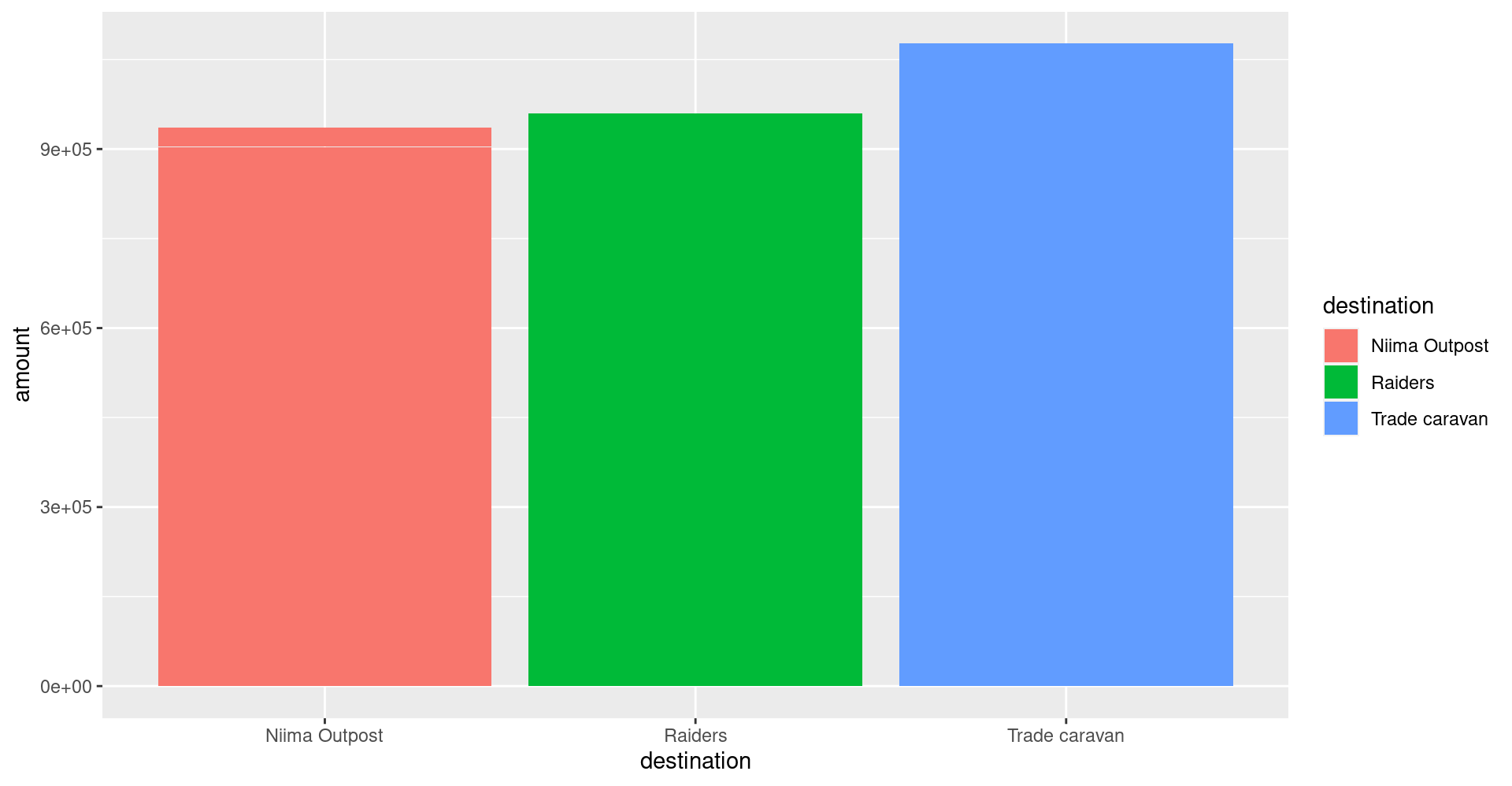
Sorting and labels
Finally, let’s order the amounts from highest to lowest (decreasing).
ggplot(scrap, aes(x = reorder(destination, amount, decreasing = TRUE),
                  y = amount,
                  fill = destination)) +
  geom_col() +
  labs(title = "The Trade Caravan receives the most scrap",
       subtitle = "Total scrap shipments on planet Jakku",
       x = "destination",
       caption = "Source: Data intercepted by BB8 in year 2023")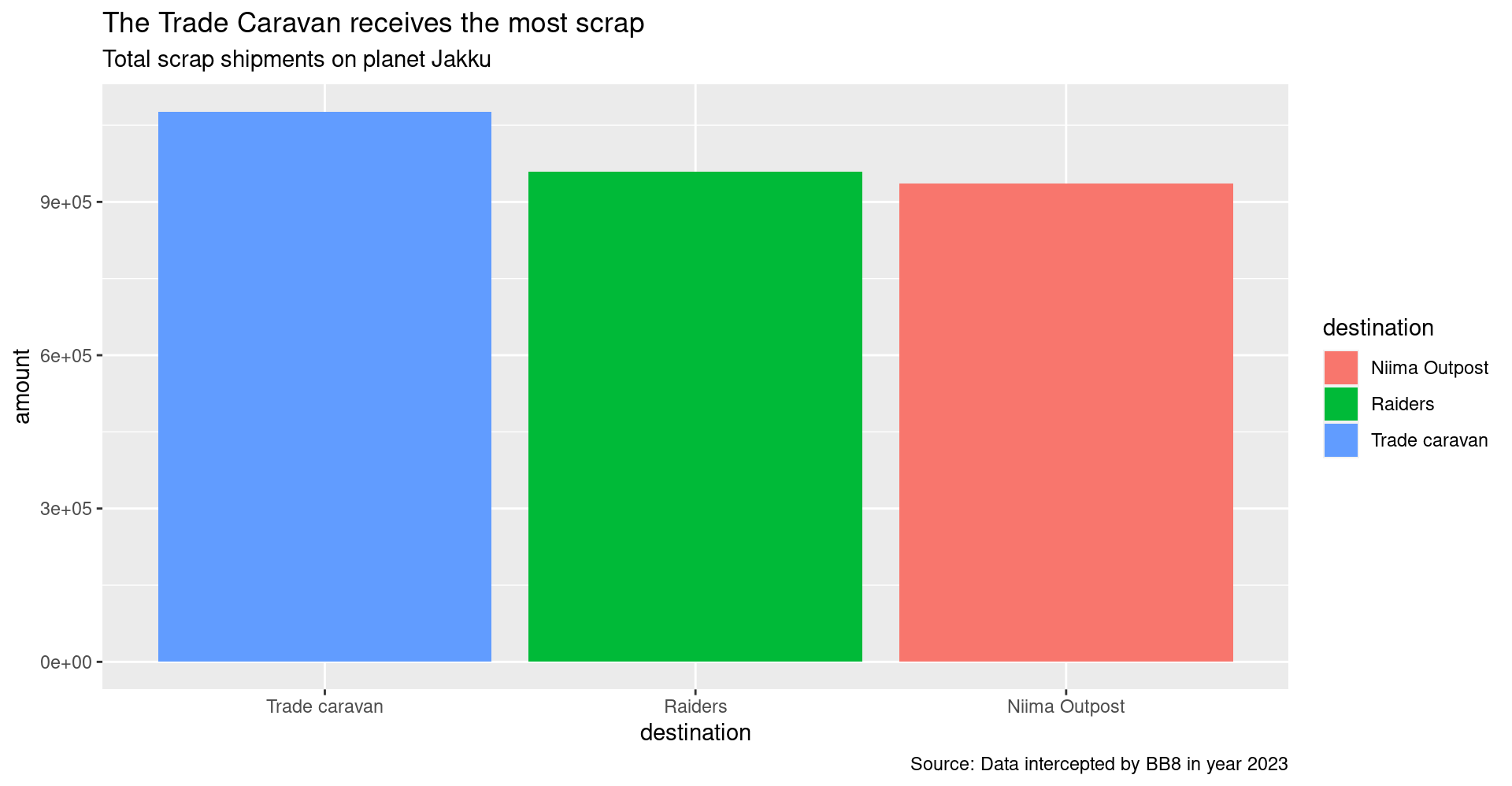
A short detour
Who’s the tallest of them all?
# Install new packages
install.packages("ggrepel")
# Load packages
library(tidyverse)
library(ggrepel)
# Get starwars character data
star_df <- starwars# What is this?
glimpse(star_df)## Rows: 87
## Columns: 14
## $ name <chr> "Luke Skywalker", "C-3PO", "R2-D2", "Darth Vader", "Leia Or…
## $ height <int> 172, 167, 96, 202, 150, 178, 165, 97, 183, 182, 188, 180, 2…
## $ mass <dbl> 77.0, 75.0, 32.0, 136.0, 49.0, 120.0, 75.0, 32.0, 84.0, 77.…
## $ hair_color <chr> "blond", NA, NA, "none", "brown", "brown, grey", "brown", N…
## $ skin_color <chr> "fair", "gold", "white, blue", "white", "light", "light", "…
## $ eye_color <chr> "blue", "yellow", "red", "yellow", "brown", "blue", "blue",…
## $ birth_year <dbl> 19.0, 112.0, 33.0, 41.9, 19.0, 52.0, 47.0, NA, 24.0, 57.0, …
## $ sex <chr> "male", "none", "none", "male", "female", "male", "female",…
## $ gender <chr> "masculine", "masculine", "masculine", "masculine", "femini…
## $ homeworld <chr> "Tatooine", "Tatooine", "Naboo", "Tatooine", "Alderaan", "T…
## $ species <chr> "Human", "Droid", "Droid", "Human", "Human", "Human", "Huma…
## $ films <list> <"The Empire Strikes Back", "Revenge of the Sith", "Return…
## $ vehicles <list> <"Snowspeeder", "Imperial Speeder Bike">, <>, <>, <>, "Imp…
## $ starships <list> <"X-wing", "Imperial shuttle">, <>, <>, "TIE Advanced x1",…Plot a histogram of the character heights.
# Height distribution
ggplot(star_df, aes(x = height)) + geom_histogram(fill = "hotpink")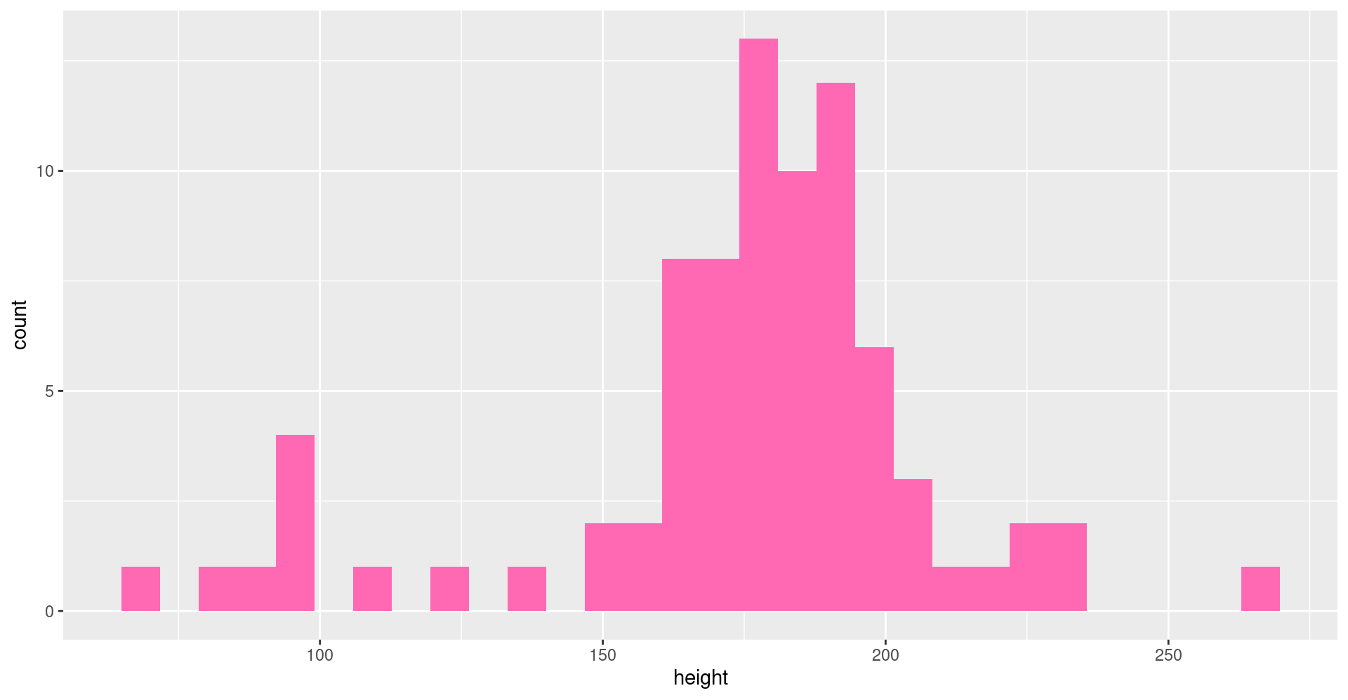
Try changing the fill color to “darkorange”.
Try making a histogram of the column
mass.
Plot comparisons between height and mass with geom_point(...).
# Height vs. Mass scatterplot
ggplot(star_df, aes(y = mass, x = height)) +
   geom_point(aes(color = species), size = 5)
Who’s who? Let’s add some labels to the points.
# Add labels
ggplot(star_df, aes(y = mass, x = height)) +
  geom_point(aes(color = species), size = 5) +
  geom_text_repel(aes(label = name))


# Use a log scale for Mass on the y-axis
ggplot(star_df, aes(y = mass, x = height)) +
  geom_point(aes(color = species), size = 5) +
  geom_text_repel(aes(label = name)) +
  scale_y_log10()
Let’s drop the “Hutt” species before plotting.
# Without the Hutt
ggplot(filter(star_df, species != "Hutt"), aes(y = mass, x = height)) +
  geom_point(aes(color = species), size = 5) +
  geom_text_repel(aes(label = name, color = species))
We can add facet_wrap to make a chart for each species.
# Split out by species
ggplot(star_df, aes(x = mass, y = height)) +
  geom_point(aes(color = species), size = 3) +
  facet_wrap("species") +
  guides(color = "none")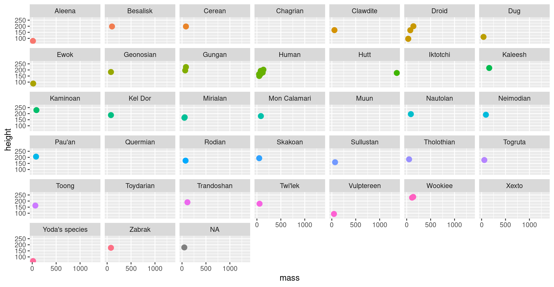
Plots of garbage
Try making a scatterplot of any two columns with geom_point().
Hint: Numeric variables will be more informative.
ggplot(scrap, aes(x = __column1__, y = __column2__)) +
    geom_point()
Colors
Now let’s use color to show the origins of the scrap
ggplot(scrap, aes(x = destination, y = credits, color = origin)) +
  geom_point()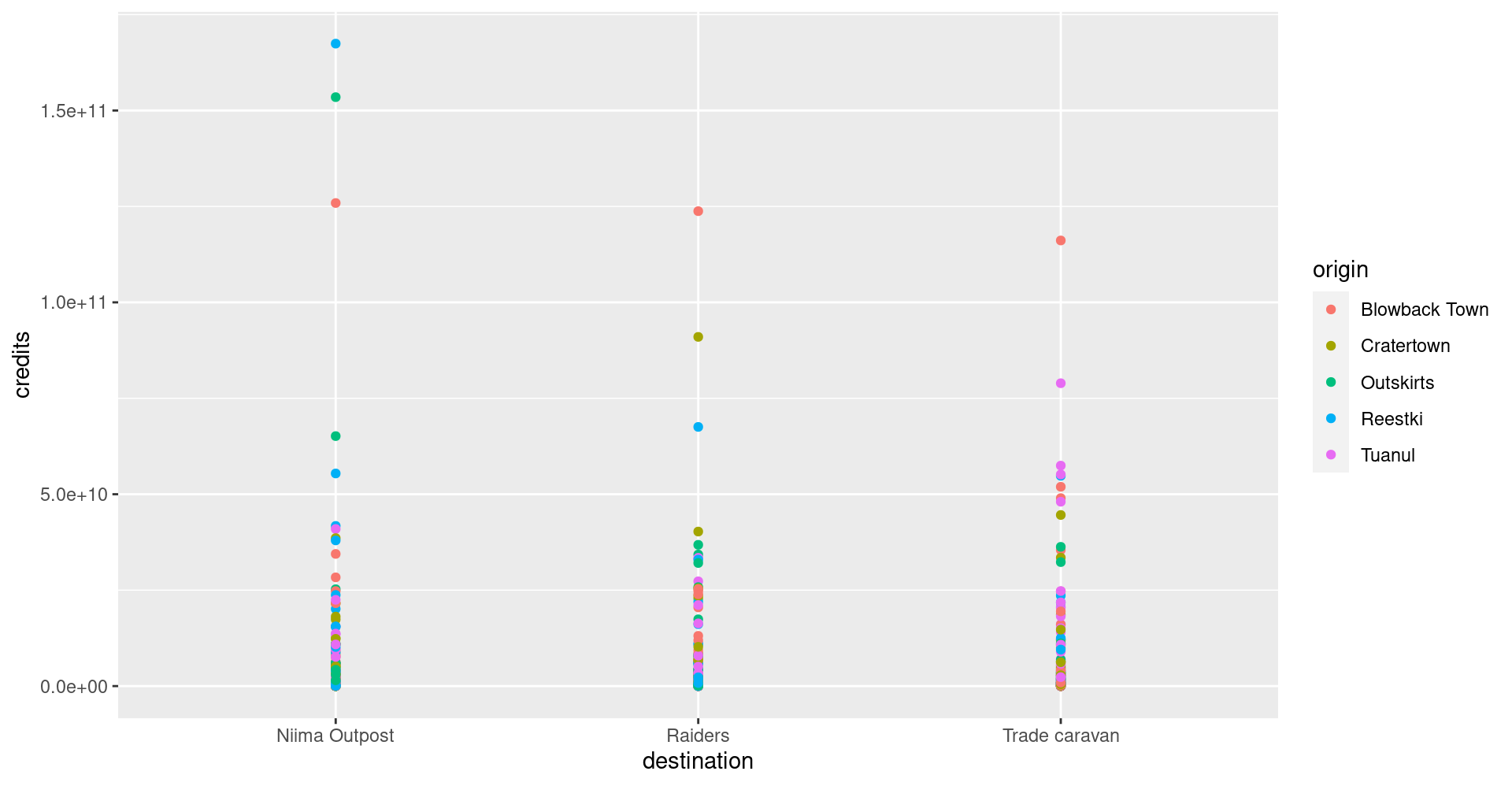
This is a A LOT of detail. Let’s make a bar chart and add up the sales to make it easier to understand.
ggplot(scrap, aes(x = destination, y = credits, fill = origin)) + geom_col()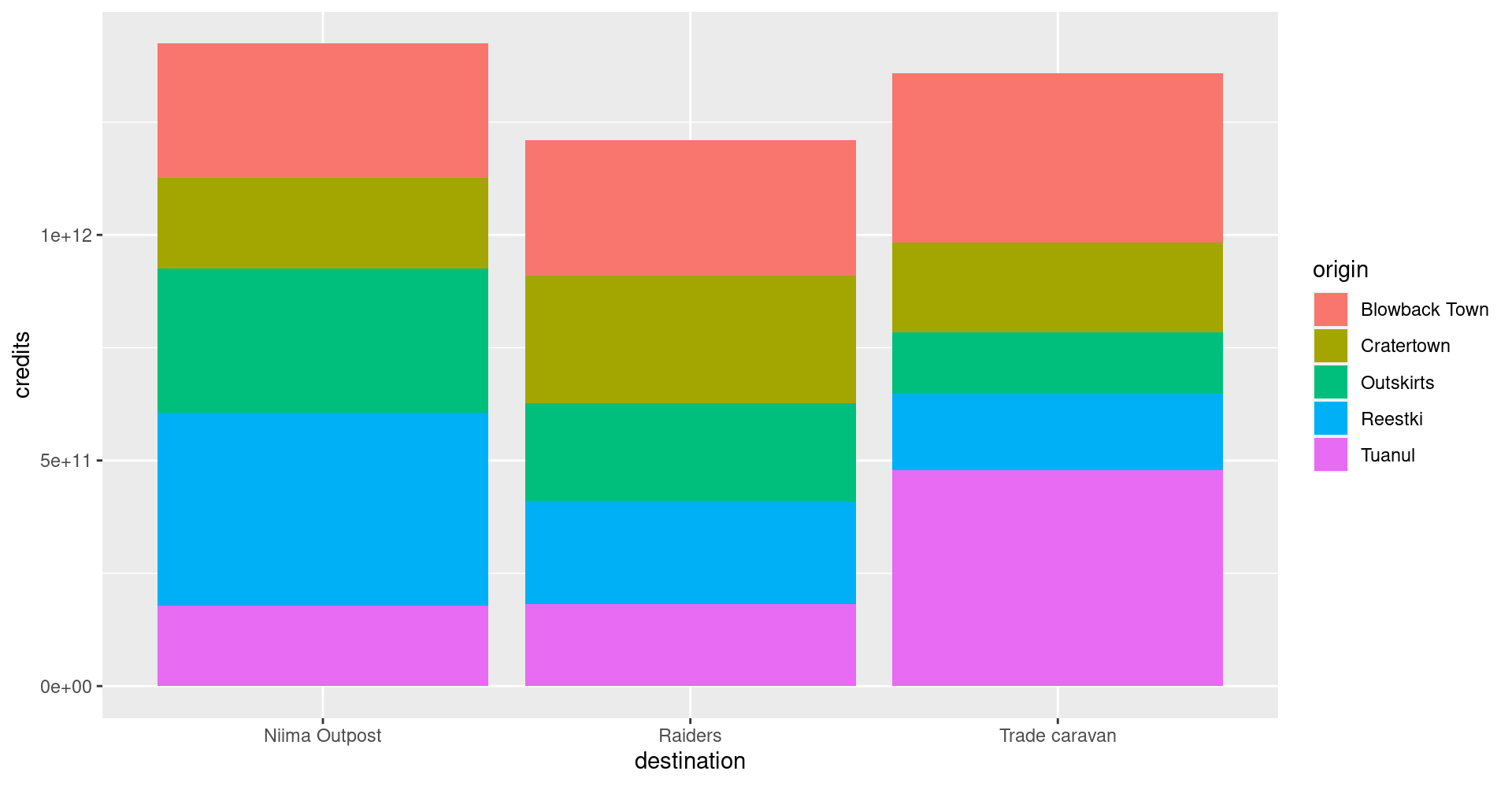
It’s still tricky to compare sales by origin. Let’s change the position of the columns.
ggplot(scrap, aes(x = destination, y = credits, fill = origin)) +
  geom_col(position = "dodge")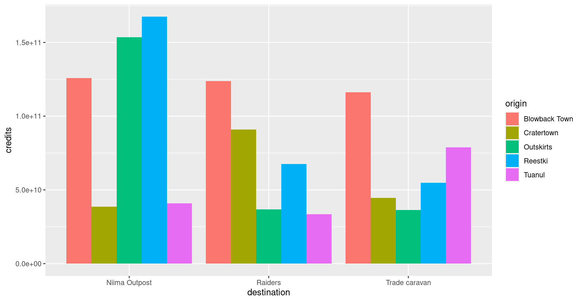
3 More Plots
Colors
Now let’s use color to show the destinations of the scrap.
ggplot(scrap, aes(x = origin, y = credits, color = destination)) +
  geom_point()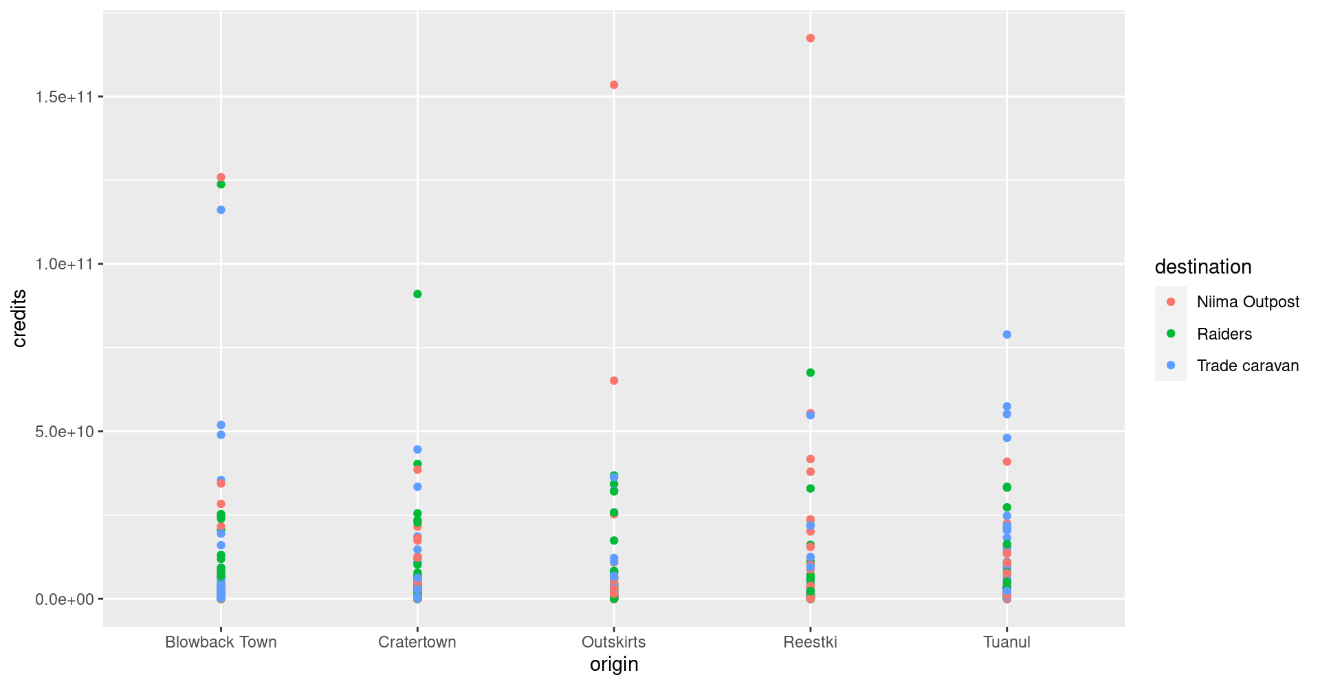
Yoda says

One way to experiment with colors is to add the layers + scale_fill_brewer() or + scale_color_brewer() to your plot. These link to colorBrewer palettes to give you accessible color themes.
Bar charts
This is way too much detail. Let’s simplify by making a bar chart that shows the total sales. Note that we use fill= inside aes() instead of color=. If we use color, we get a colorful outline and gray bars.
ggplot(scrap, aes(x = origin, y = credits, fill = destination)) +
  geom_col()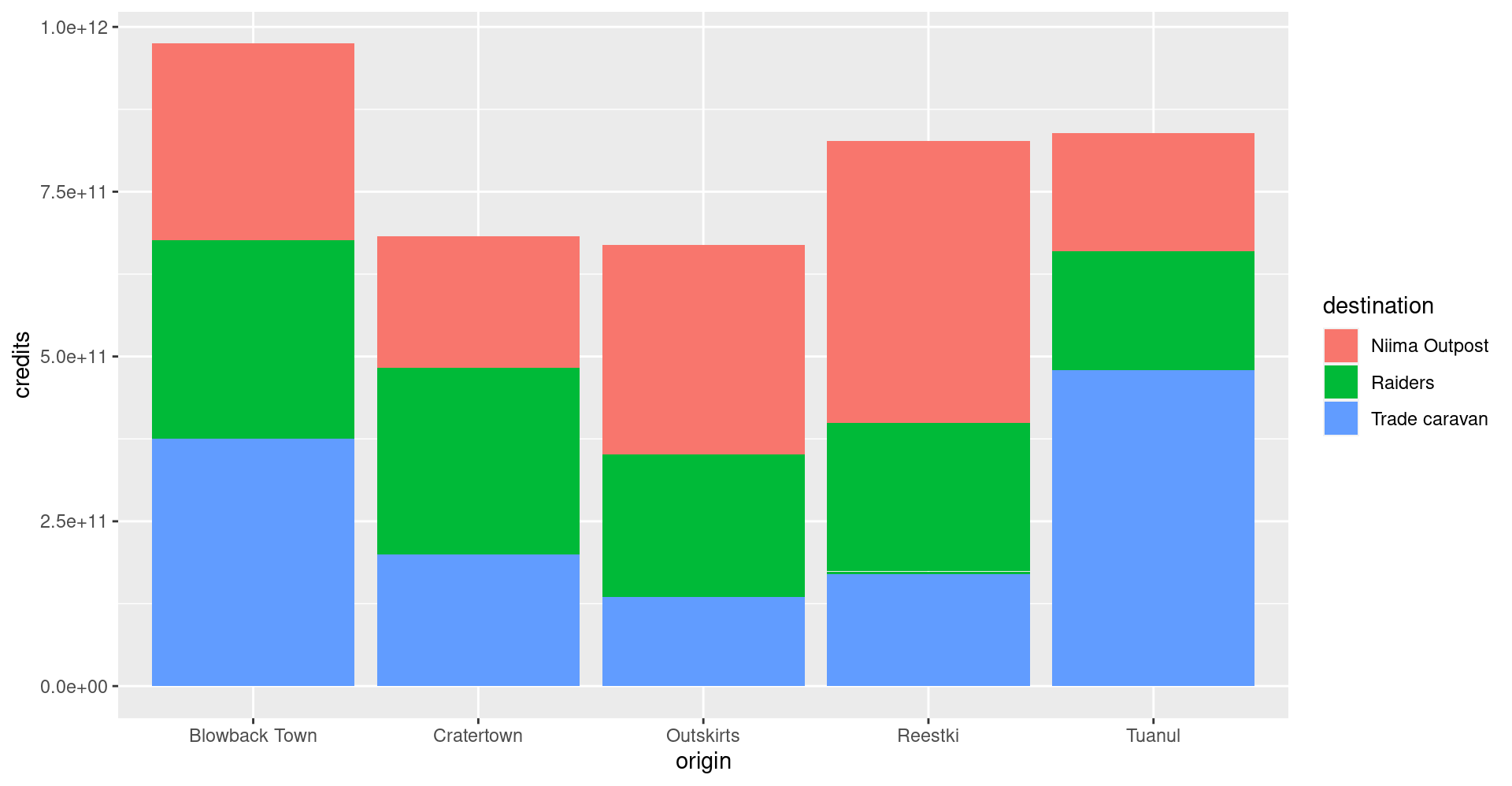
Let’s change the position of the bars to make it easier to compare sales by destination for each origin? Remember, you can use help(geom_col) to learn about the different options for that plot. Feel free to do the same with other geom_’s as well.
ggplot(scrap, aes(x = origin, y = credits, fill = destination)) +
  geom_col(position = "dodge")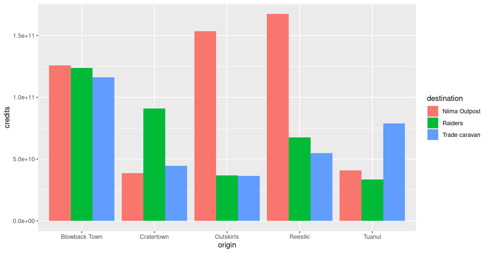
Facet wrap
Does the chart feel crowded to you? Let’s use the facet wrap function to put each origin on a separate chart.
ggplot(scrap, aes(x = origin, y = credits, fill = destination)) +
  geom_col(position = "dodge") +
  facet_wrap("destination")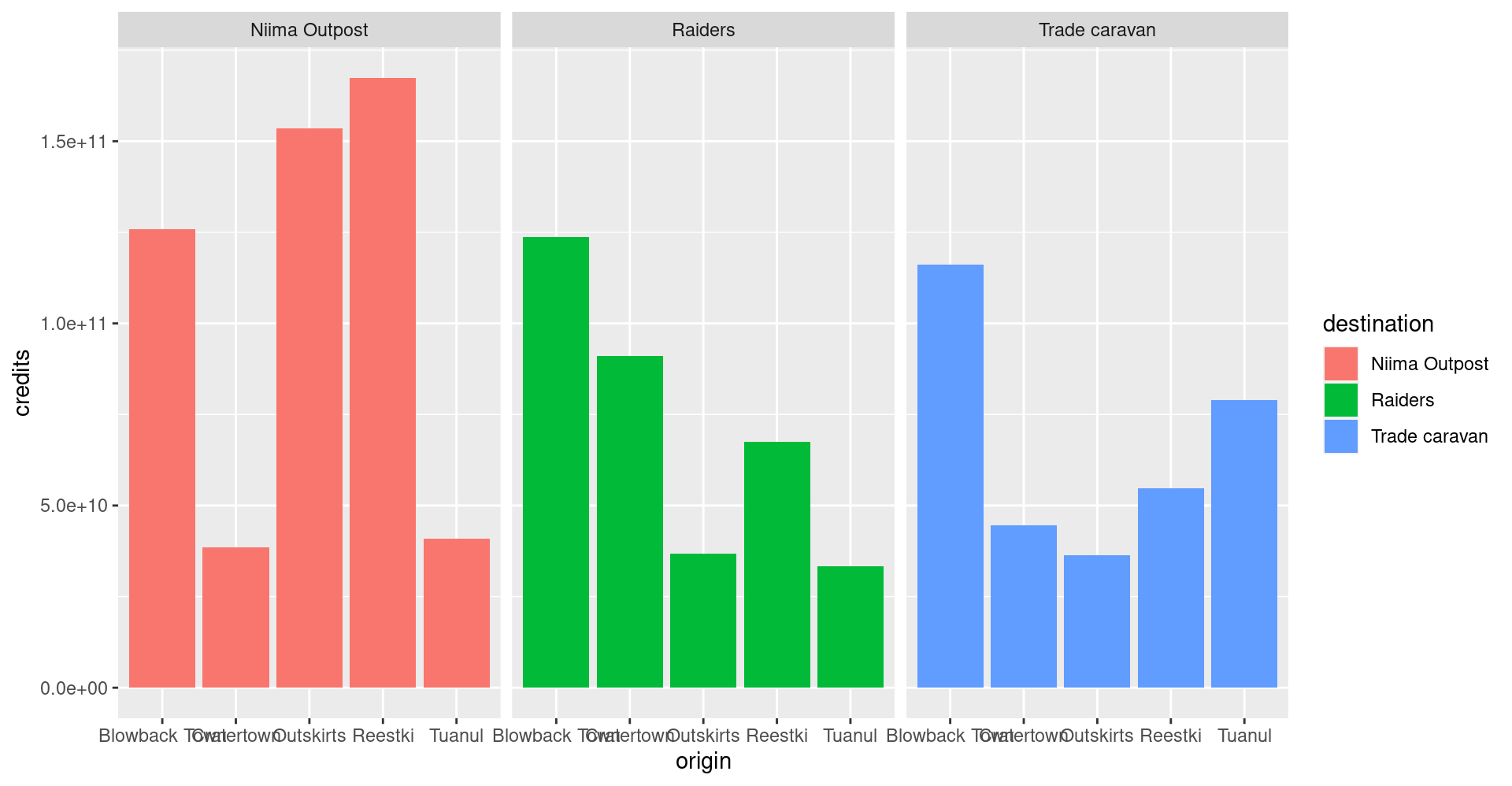
Labels
We can add lables to the chart by adding the labs() layer. Let’s give our chart from above a title.
Titles and labels
ggplot(scrap, aes(x = origin, y = credits, fill = destination)) +
  geom_col(position = "dodge") +
  facet_wrap("destination") +
  labs(title    = "Scrap sales by origin and destination",
       subtitle = "Planet Jakku",
       x        = "Origin",
       y        = "Total sales")
Add lines
More layers! Let’s say we were advised to avoid sales that were over 50 Billion credits. Let’s add that as a horizontal line to our chart. For that, we use
geom_hline().
Reference lines
ggplot(scrap, aes(x = origin, y = credits, fill = destination)) +
  geom_col(position = "dodge") +
  facet_wrap("destination") +
  labs(title    = "Scrap sales by origin and destination",
       subtitle = "Planet Jakku",
       x        = "Origin",
       y        = "Total sales") +
  geom_hline(yintercept = 5E+10, color = "black", size = 1)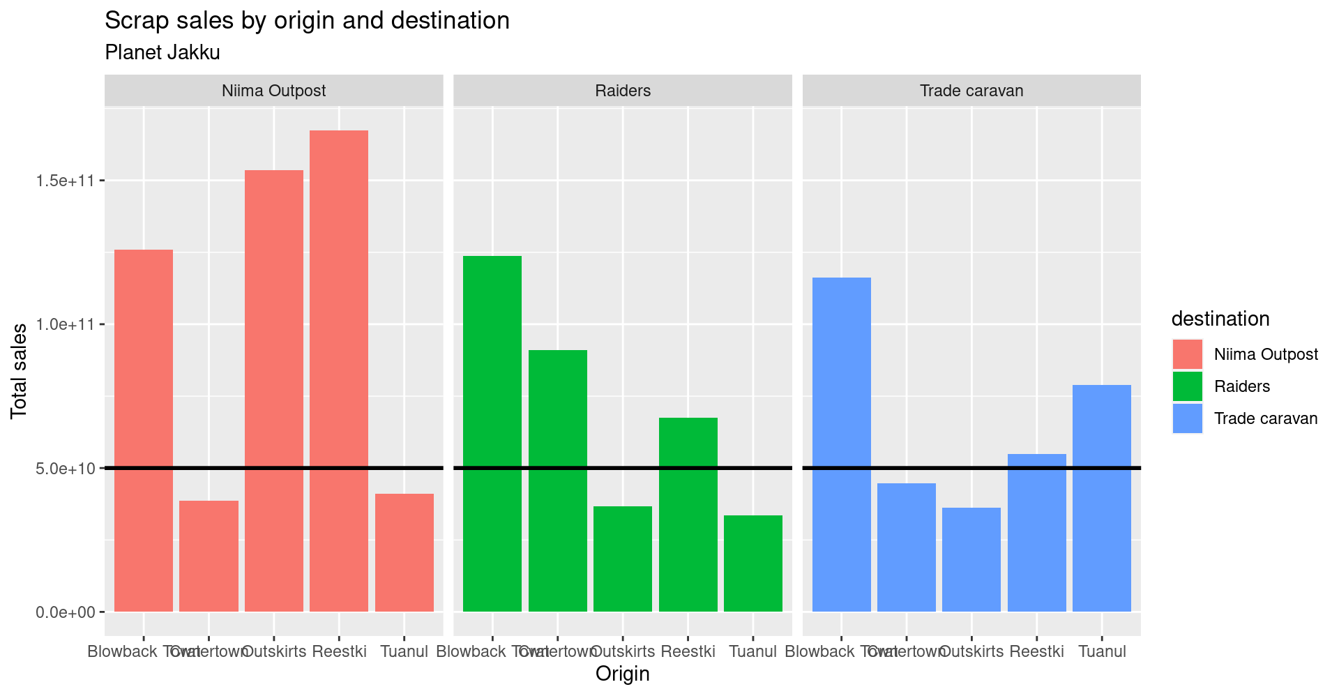
Drop 2.2e+06 scientific notation
Want to get rid of that ugly scientific notation? We can use options(scipen = 999). Note that this is a general setting in R. Once you use options(scipen = 999) in your current session, you don’t have to use it again. (Like loading a package, you only need to run the line once when you start a new R session).
options(scipen = 999)

ggplot(scrap, aes(x = origin, y = credits, fill = destination)) +
  geom_col(position = "dodge") +
  facet_wrap("destination") +
  theme_bw() +
  labs(title = "Scrap sales by origin and destination",
       x     = "Origin",
       y     = "Total sales")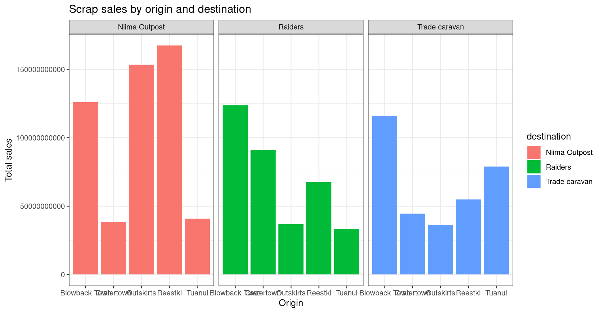
Explore!
Let’s say we don’t like printing so many zeros and want the labels to be in Millions of credits. Any ideas on how to make that happen?
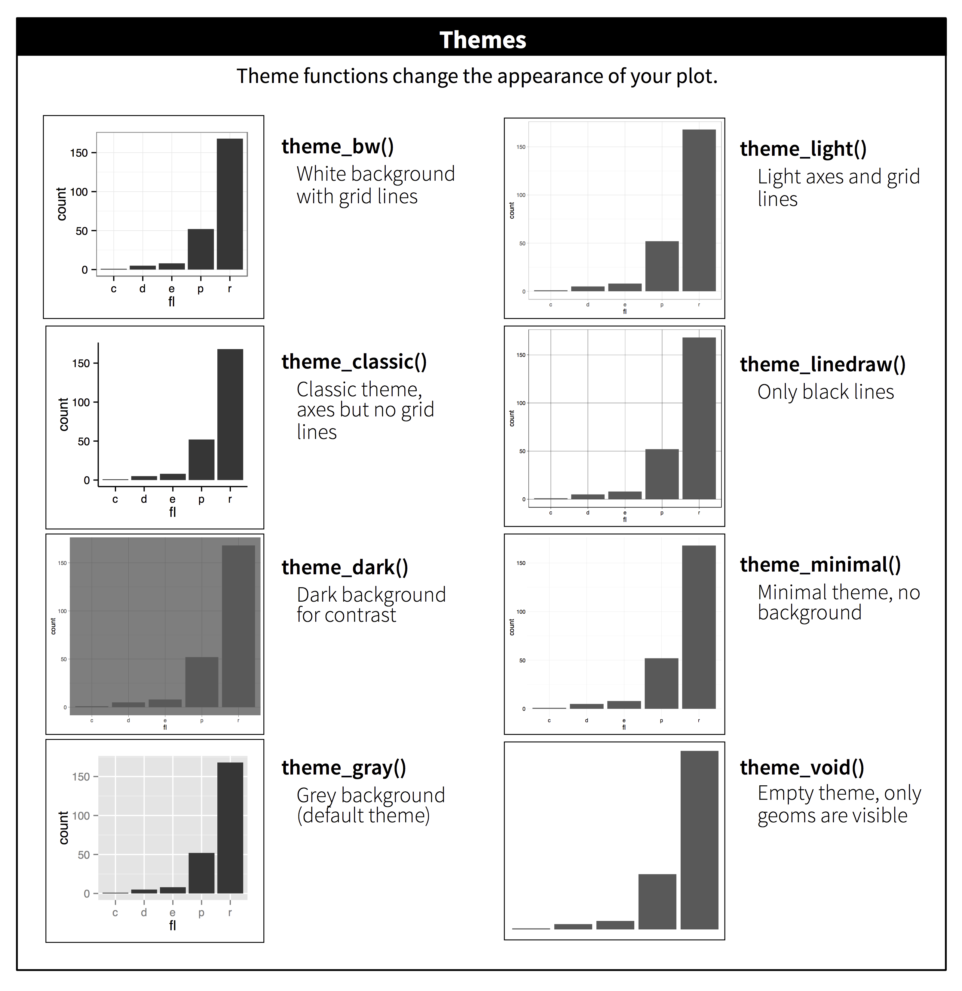
Themes
You may not like the appearance of these plots. ggplot2 uses theme functions to change the appearance of a plot. View the list of themes here.
Try some.
ggplot(scrap, aes(x = origin, y = credits, fill = destination)) +
  geom_col(position = "dodge") +
  facet_wrap("destination") +
  theme_dark()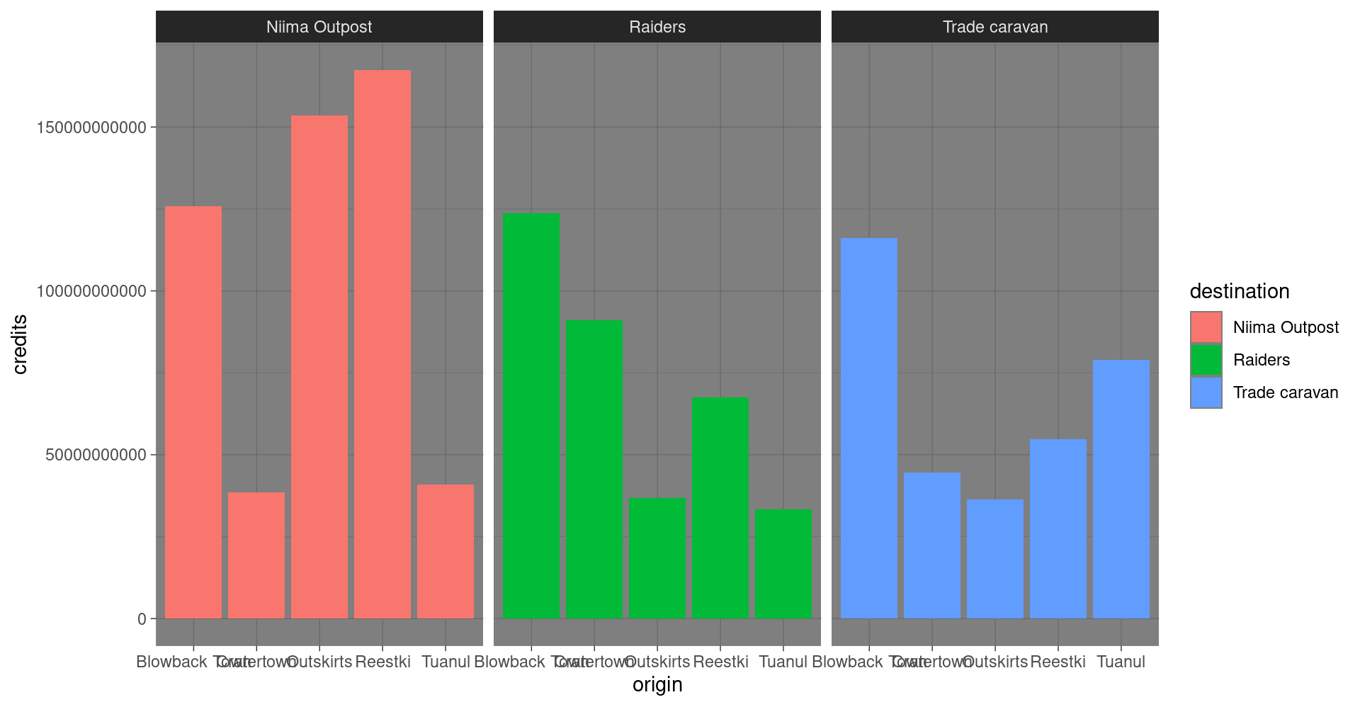
Explore!
Be bold and make a boxplot. We’ve covered how to do a scatterplot with geom_point and a bar chart with geom_col, but how would you make a boxplot showing the prices at each destination? Feel free to experiment with color ,facet_wrap, theme, and labs.
May the force be with you.
Save plots
You’ve made some plots you can be proud of, so let’s learn to save them so we can cherish them forever. There’s a function called ggsave to do just that.
So how do we ggsave our plots?
Let’s try help(ggsave) or ?ggsave.
# Get help
help(ggsave)
?ggsave

# Run the R code for your favorite plot first
ggplot(data, aes()) +
   .... +
   ....

# Then save your plot to a png file of your choosing
ggsave("results/plot_name.png")
Learn more about saving plots at http://stat545.com/
It’s Finn time
Seriously, let’s pay that ransom already.
Q: Where should we go to get our 10,000 Black boxes?
Step 1: Make a geom_col() plot showing the total pounds of Black boxes shipped to each destination.
ggplot(cheap_scrap, aes(x =  ______ , y =  ______ )) +
   geom_
Show code
ggplot(cheap_scrap, aes(x = destination, y = total_pounds) ) +
   geom_col()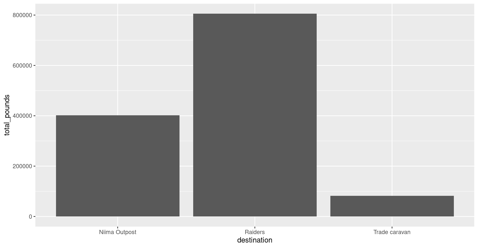
Pop Quiz!
Which destination has the most pounds of the cheapest item?
Trade caravan
Niima Outpost
Raiders
Show solution
Raiders
Woop! Go get em! So long Jakku - see you never!
PORGTASTIC
Woop!
We found enough Black Boxes to trade Plutt and get the whole crew back together. Serious kudos to you.
Let’s sit back, relax, and read some ggplot glossaries.
Finally…

Plot glossary
Table of aesthetics
| aes() |
|---|
x = |
y = |
alpha = |
fill = |
color = |
size = |
linetype = |
Table of geoms
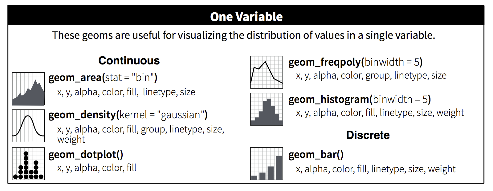
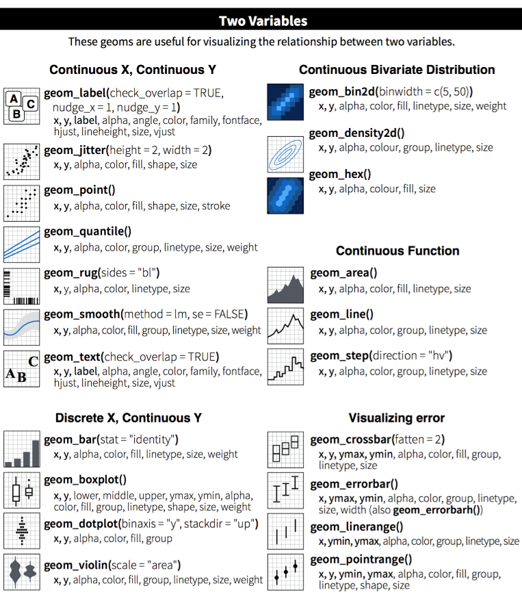
Table of themes
You can customize the look of your plot by adding a theme() function.
Plots Q+A
- How to modify the gridlines behind your chart?
- Try the different themes at the end of this lesson:
+ theme_light()or+ theme_bw() - Or modify the color and size with
+ theme(panel.grid.minor = element_line(colour = "white", size = 0.5))
- Try the different themes at the end of this lesson:
- How do you set the x and y scale manually?
- Here is an example with a scatter plot:
ggplot() + geom_point() + xlim(beginning, end) + ylim(beginning, end) - Warning: Values above or below the limits you set will not be shown. This is another great way to lie with data.
- Here is an example with a scatter plot:
- How do you get rid of the legend if you don’t need it?
geom_point(aes(color = county), guide = FALSE)- The R Cookbook shows a number of ways to hide legends.
- I only like dashed lines. How do you change the linetype to a dashed line?
geom_line(aes(color = facility_name), linetype = "dashed")- You can also try
"dotted"and"dotdash", or even"twodash"
- How many colors are there in R? How does R know
hotpinkis a color?- There is an R color cheatsheet
- As well as a list of R color names
library(viridis)provides some great default color palettes for charts and maps.- This Color web tool has palette ideas and color codes you can use in your plots
- There is an R color cheatsheet
Homeworld training
- Load one of the data sets below into R
- Porg contamination on Ahch-To: “https://mn-r.netlify.com/data/porg_samples.csv”
- Planet Endor air samples: “https://mn-r.netlify.com/data/air_endor.csv”
- Or use data from a recent project of yours
- Create 3 plots using the data.
- Don’t worry if it looks really wrong. Consider it art and try again.
Yoda says
When you add more layers to your plot using +, remember to place it at the end of each line.
# This will work
ggplot(scrap, aes(x = origin, y = credits)) +
  geom_point()

# So will this
ggplot(scrap, aes(x = origin, y = credits)) + geom_point()

# But this won't
ggplot(scrap, aes(x = origin, y = credits))
  + geom_point()